Trading Places: a Network Analysis of Global Commerce
Note: This post was originally a short technical article I shared on the Wolfram Community forum. For an interactive experience with live code or to download this text alongside the source code, please visit the original post here.
Introduction
The global trade network is the backbone of international commerce, linking countries through a complex web of import and export relationships. Not only does it characterise the flow of goods and services, but it also shapes economic strategies and geopolitical landscapes.
While the true global trade network is incredibly complex, with millions of individual transactions occurring daily across countless products and services, we can still build meaningful representations that capture important aspects of global commerce ties. In this article, I’ll use Wolfram Knowledgebase country data from The World Factbook to define graphs of major import and export relationships on the global stage.
By constructing network representations of international trade, we can visualize and quantify the connections between nations, revealing patterns that might otherwise remain hidden in tables of statistics. Which countries serve as central hubs in global commerce? How do smaller economies interact with larger ones? Where do we see asymmetric dependencies? And how do natural trading communities form? In this short article, I’ll explore these questions through a series of visualizations and analyses.
Setup: Building a Dataset of International Commercial Relationships
The first thing we need to do is gather data on import and export relationships between countries. We can get this information from the Wolfram Knowledgebase.
Let’s start by creating a list of all countries:

We’re going to extract values associated with country entities above. Manually, we might access one such value like this:


We can also ask Wolfram Language to check the source of entity property data like so:


Now, let’s create a dataset of import and export information for these countries. We’ll extract key trade properties and remove entries with missing data.
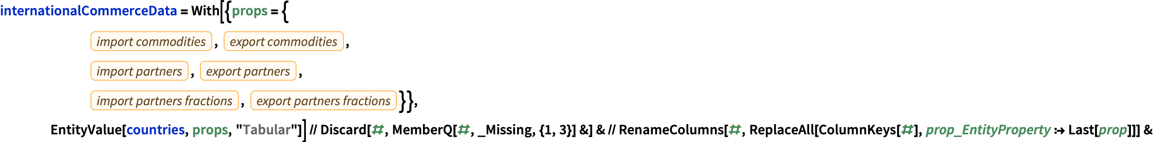
Since these are tabular data, we can represent them in a Tabular object (introduced in Wolfram Language 14.2). The Tabular representation makes it possible to apply standard data science pipeline techniques including filtering, aggregation, transformation, and visualisation to our data easily.
The dataset we’ve built contains international trade information for countries around the world, with data sourced from The World Factbook. Each column represents a key aspect of a country’s trade profile:
- ImportCommodities: Major goods and product categories that each country primarily imports from international markets. These represent key dependencies on foreign products.
- ExportCommodities: Major goods and product categories that each country primarily sells to international markets. These represent the country’s key commercial outputs.
- ImportPartners: Major countries from which each nation sources its imports. These represent the primary international suppliers for each country.
- ExportPartners: Major countries to which each nation sells its exports. These represent the primary international customers for each country.
- ImportPartnersFractions: The approximate percentage of total imports that come from each major import partner. This quantifies the relative importance of each supplier country.
- ExportPartnersFractions: The approximate percentage of total exports that go to each major export partner. This quantifies the relative importance of each customer country.
Not only do these data provide a coarse sense of who trades with whom, but also what they trade and how significant those relationships are in percentage terms.
Construction and Analysis of Network Representations of Global Commerce
Global commerce naturally lends itself to network analysis, where countries represent nodes (vertices) and trade relationships form the connections (edges) between them. Using our dataset, we can construct several different graph representations that reveal different aspects of international trade patterns.
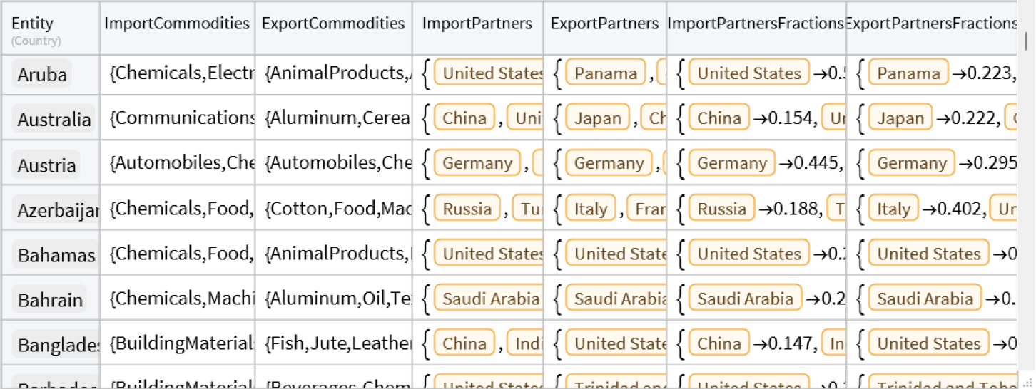
Unweighted international trade network representations
The simplest representations we can construct from our dataset are unweighted directed graphs where an edge from country A to country B indicates that B is a major trading partner of A. We can create two complementary networks:
- Import Network: In these networks, an edge from country A to country B means that country A imports goods from country B. The direction of the edge follows the flow of money (A pays B for goods).
- Export Network: Here, an edge from country A to country B means that country A exports goods to country B. The direction follows the flow of goods.
Let’s construct and visualise these graphs.
*Construct the global major import partner graph: *
In[]:= globalImportRelationships = Graph[Normal[Dataset[internationalCommerceData][All, Keys][Keys]],
    Flatten[FromTabular[ConstructColumns[internationalCommerceData,
       "Edges" -> (Thread[#Entity -> #ImportPartners] &)], "Matrix"]], ImageSize -> Small]
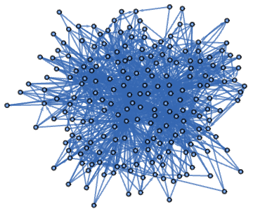
Construct the global major export partner graph:
In[]:= globalExportRelationships = Graph[
    Normal[Dataset[internationalCommerceData][All, Keys][Keys]],
    Flatten[FromTabular[ConstructColumns[internationalCommerceData,
       "Edges" -> (Thread[#Entity -> #ExportPartners] &)], "Matrix"]], ImageSize -> Small]
These networks are quite tangled, so it will help to represent them geographically.
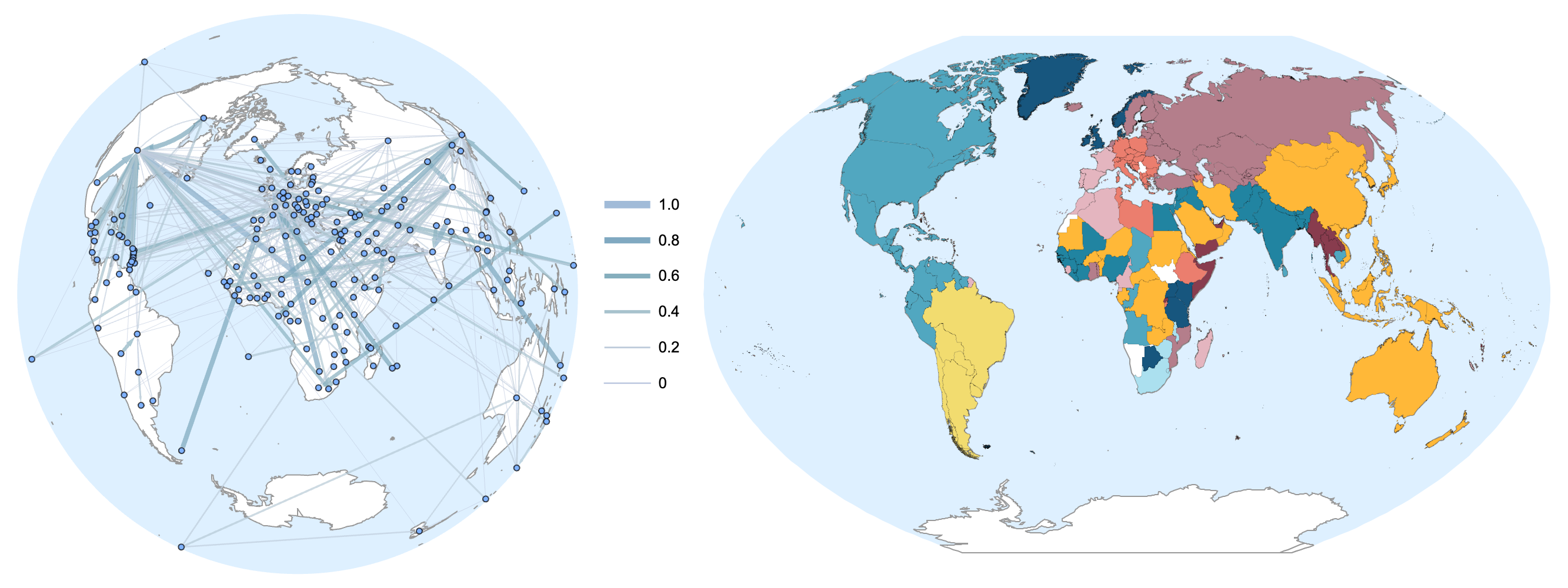
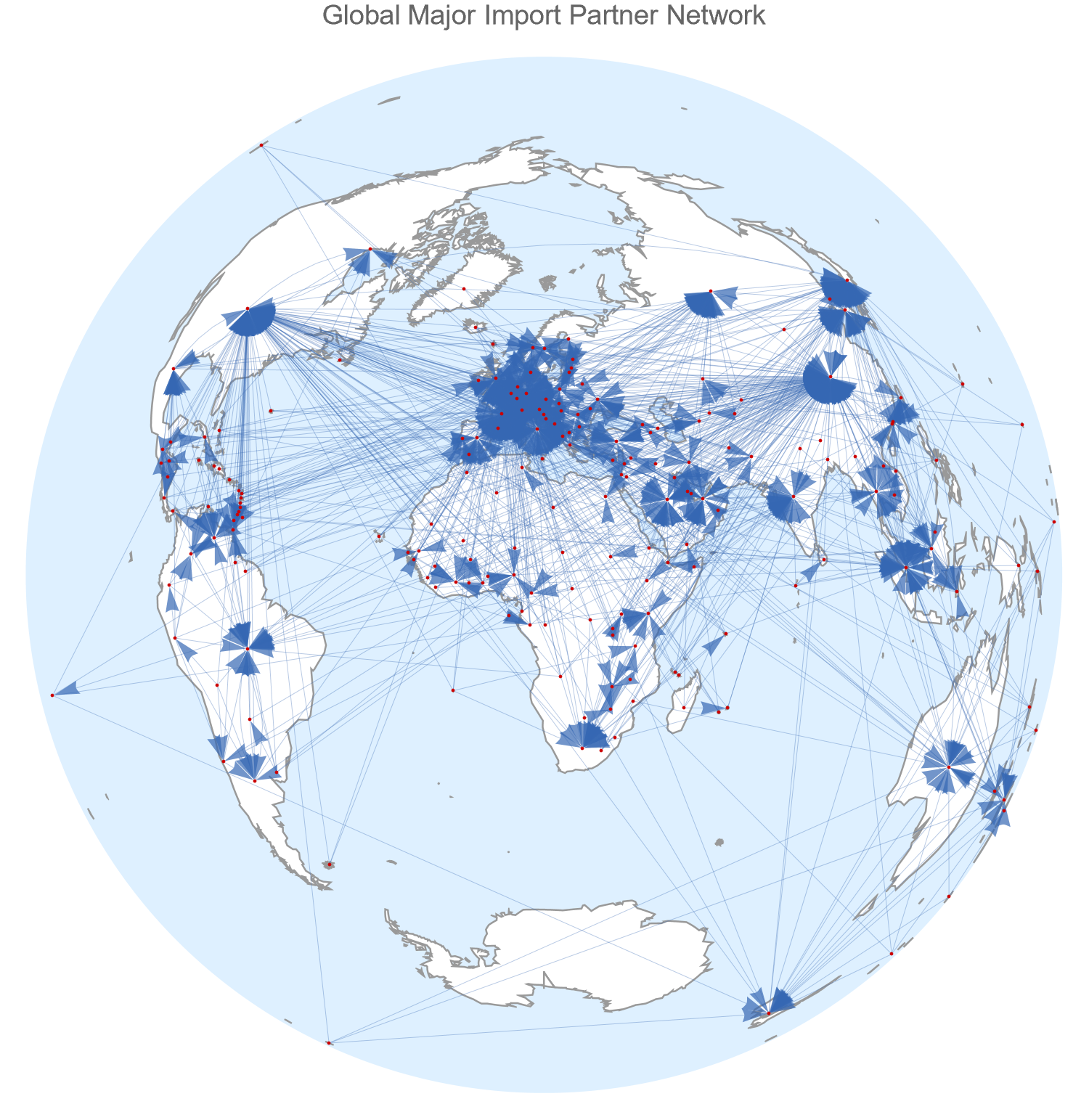
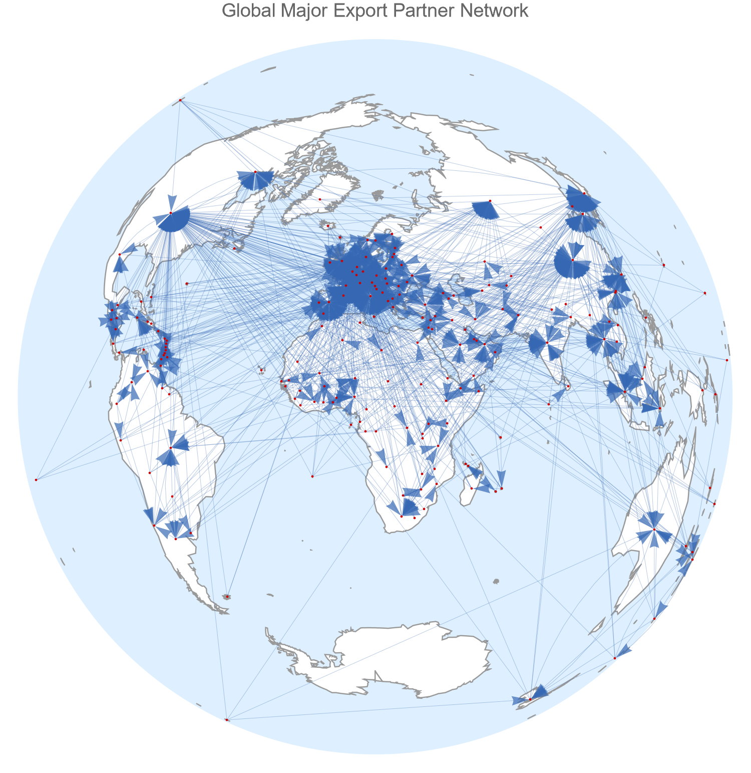
Visualise these graphs on maps:
In[]:= Row[Rasterize[#, ImageSize -> Large, RasterSize -> 1500] & /@ {
     GeoGraphPlot[globalImportRelationships,
      EdgeStyle -> Thin, VertexSize -> Small,
      GeoProjection -> "LambertAzimuthal", ImageSize -> 600, PlotRangePadding -> .1,
      PlotLabel -> Style["Global Major Import Partner Network", 15],
      GeoBackground -> {"Coastlines", {"Land" -> White}}],
     GeoGraphPlot[globalExportRelationships,
      EdgeStyle -> Thin, VertexSize -> Small,
      GeoProjection -> "LambertAzimuthal", ImageSize -> 600, PlotRangePadding -> .1,
      PlotLabel -> Style["Global Major Export Partner Network", 15],
      GeoBackground -> {"Coastlines", {"Land" -> White}}]
    }]
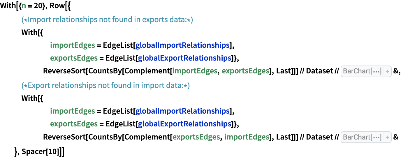
Analysis of discrepancies between import and export networks
While both networks are very visually similar, because they take different perspectives, the import and export graphs paint slightly different pictures of global trade. One source of discrepancies between the networks is asymmetries in trade relationships: The fact that country A features in the list of major partners to country B does not always entail that B features in the list of major partners of A. To better understand these asymmetries, we can study which relationships appear in one network but not the other.
- Two-way major partnerships: If an edge A B is found in both graphs, it means that B is a major provider of goods to A (relative to A’s total imports) and A is a major exporter to B (relative to A’s total exports). This suggests A is economically dependent on its import and export relationships with B, as they make up significant portions of A’s total imports and exports.
- Import dependencies: If a A B exists in the import network but not in the export network, it means B is a major source of imports to A, but is not a major export destination for A’s goods. This suggests A depends on B’s goods, but B is not a significant market for A.
- Export dependencies: Conversely, if A B exists in the export network but not in the import network, it means B is a major destination for A’s exports, but not one of A’s major import sources. ****This suggests A depends on B as a market for its goods, but not on imports from B.
Let’s examine which countries most frequently appear in these “one-way” relationships:
The charts below show the 20 countries which most frequently appear as the “source” country (country A) in these asymmetric import and export relationships. The left chart ranks countries by the number of major trade partners with whom they have major import dependencies. The right chart ranks countries by the number of major trade partners with whom they have major export dependencies.

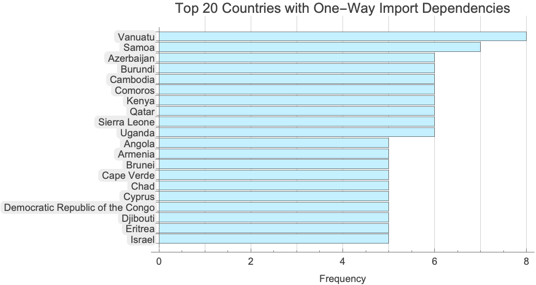
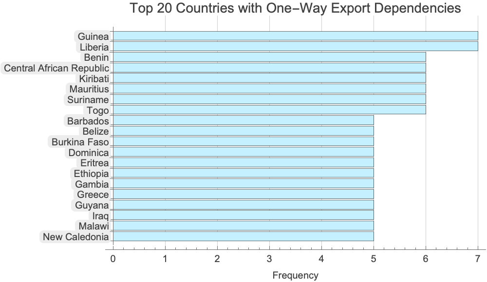
Notably, smaller economies like Vanuatu, Samoa, and Guinea appear frequently in these one-way relationships, suggesting they may have significant dependencies on specific trading partners that don’t reciprocally depend on them.
These next charts reveal which countries most frequently appear as the “destination” country (country B) in asymmetric relationships. The left chart shows countries that are most frequently considered important import sources, but not major export destinations for their partners goods. The right chart shows countries that are most frequently considered important export destinations, but not major import sources:
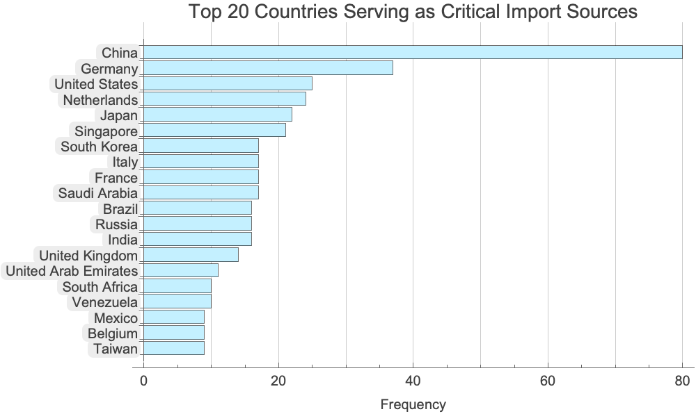
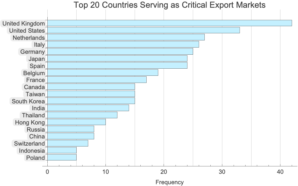
China dominates as a critical import source for numerous countries that don’t reciprocally consider China a major export destination. Meanwhile, the United Kingdom and United States serve as vital export markets for many nations that don’t rely heavily on them for imports. These patterns highlight the uneven dependencies in global trade - smaller economies often have one-way trade relationships with economic powerhouses, while major economies maintain more balanced bilateral trade relationships with their key partners. This asymmetry creates potential vulnerabilities where countries depend economically on partners who don’t equally depend on them.
Country Centrality in Global Commerce
Network centrality measures help us identify which countries play pivotal roles in the global trade network. Different centrality metrics capture different aspects of a country’s importance in international trade.
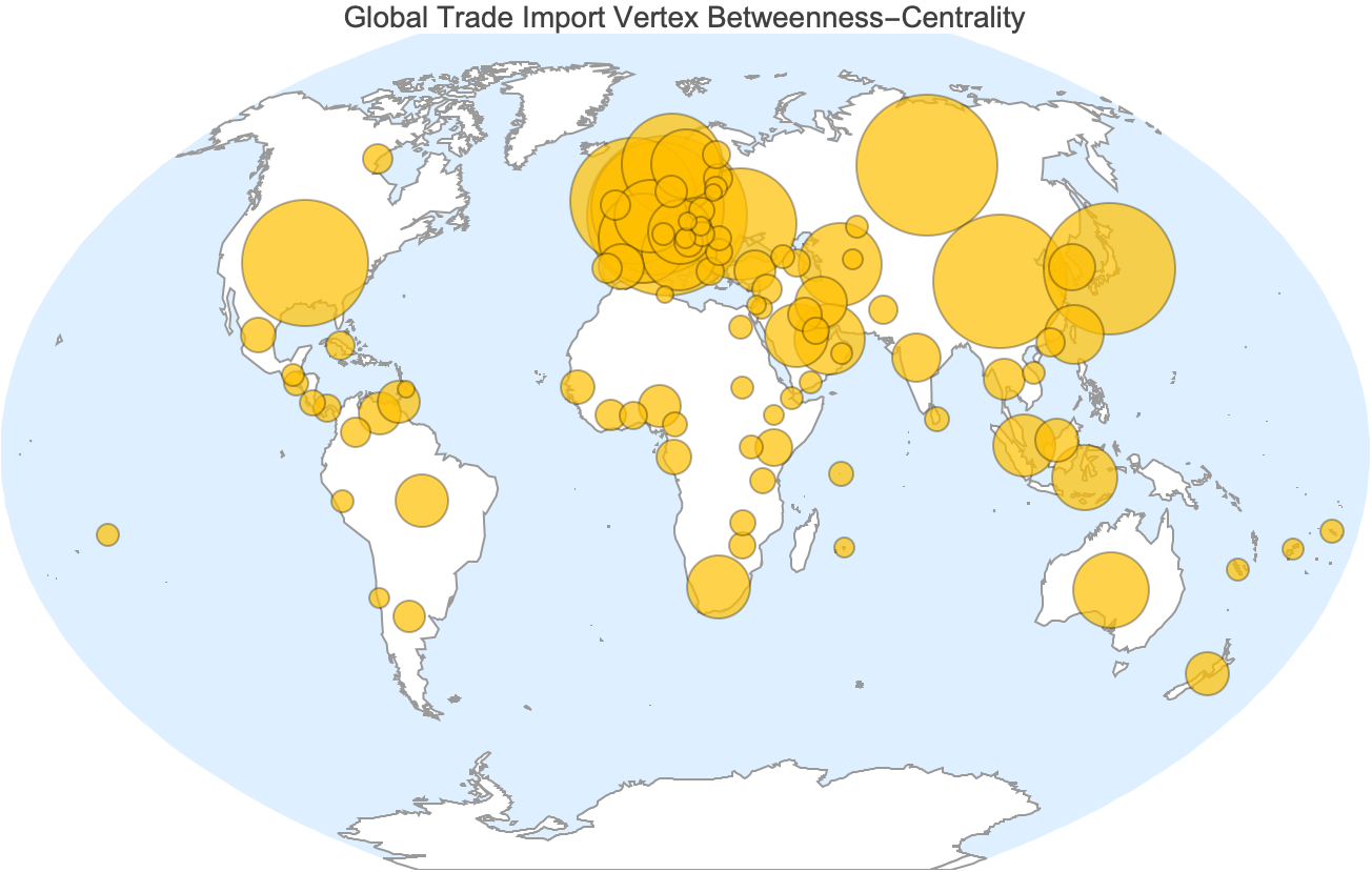
Betweenness centrality measures the extent to which a country acts as an intermediary in the trade network. It is calculated based on the number of times a country falls on the shortest path between other countries. High betweenness centrality indicates that a country is a major hub for trade, facilitating transactions between many other nations. This can highlight countries that play a vital role in the distribution of goods globally.
Visualization of vertex betweenness centrality on the global imports network:
In[]:= Module[{g = globalImportRelationships},
   g = Graph[g, VertexCoordinates -> Map[First[GeoGridPosition[#, "WinkelTripel"]] &, VertexList[g]]];
   GeoBubbleChart[Thread[VertexList[g] -> BetweennessCentrality[g]],
    GeoProjection -> "WinkelTripel",
    PlotLabel -> Style["Global Trade Import Vertex Betweenness-Centrality", 14],
    GeoBackground -> {"Coastlines", {"Land" -> White}}]
  ]
Visualization of vertex betweenness centrality on the global exports network:
In[]:= Module[{g = globalExportRelationships},
   g = Graph[g, VertexCoordinates -> Map[First[GeoGridPosition[#, "WinkelTripel"]] &, VertexList[g]]];
   GeoBubbleChart[Thread[VertexList[g] -> BetweennessCentrality[g]],
    GeoProjection -> "WinkelTripel",
    PlotLabel -> Style["Global Trade Export Vertex Betweenness-Centrality", 14],
    GeoBackground -> {"Coastlines", {"Land" -> White}}]
  ]
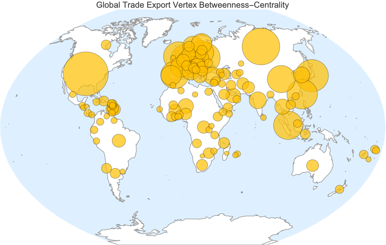
Nations like the United States, China, and Germany show substantial centrality, reflecting their critical positions in both importing and exporting goods. These countries are central players in the international market, not just due to their economic size but also because they serve as major conduits for international trade.
Countries with high betweenness centrality play a significant role in the stability of global trade networks. Disruptions in these countries, be it political instability, natural disasters, or economic sanctions, could have ripple effects, impacting trade flows globally.
Weighted international trade network representations
While our previous unweighted network analysis provided insights into the structure of global trade relationships, it treated all connections equally. In reality, trade relationships vary significantly in their importance. Some countries depend heavily on specific trading partners, with a large percentage of their imports or exports flowing through them.
By incorporating the percentage data from our dataset (ImportPartnersFractions and ExportPartnersFractions), we can create weighted networks that better reflect the actual economic significance of each relationship. In these weighted networks, the thickness of each edge represents the percentage of a country’s total imports or exports that flows through that relationship.
*Construct the weighted global import partner graph: *

*Construct the weighted global export partner graph: *


Once again, let’s plot these networks geographically:
Visualise the weighted global import and export partner networks on a map:
In[]:= Row[Rasterize[#, ImageSize -> Large, RasterSize -> 1500] & /@ {
     GeoGraphValuePlot[globalWeightedImportRelationships,
      GeoProjection -> "LambertAzimuthal", ImageSize -> 500, ColorFunction -> "Aquamarine",
      EdgeValueRange -> {0, 1}, EdgeValueSizes -> 1/100, PlotRangePadding -> .1, VertexSize -> 5,
      PlotLegends -> Automatic, MinPointSeparation -> None, PlotLabel -> Style["Global Weighted Major Import Partner Network", 15],
      GeoBackground -> {"Coastlines", {"Land" -> White}}],
     GeoGraphValuePlot[globalWeightedExportRelationships,
      GeoProjection -> "LambertAzimuthal", ImageSize -> 500, ColorFunction -> "Aquamarine",
      EdgeValueRange -> {0, 1}, EdgeValueSizes -> 1/100, PlotRangePadding -> .1, VertexSize -> 5,
      PlotLegends -> Automatic, MinPointSeparation -> None, PlotLabel -> Style["Global Weighted Major Export Partner Network", 15],
      GeoBackground -> {"Coastlines", {"Land" -> White}}]
    }]
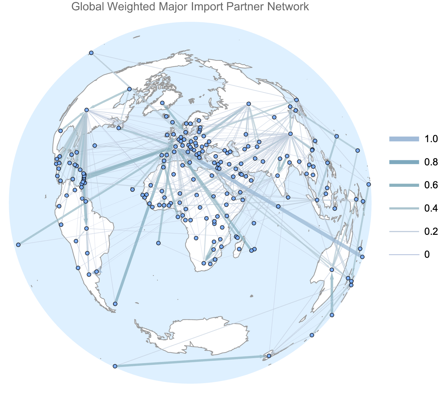
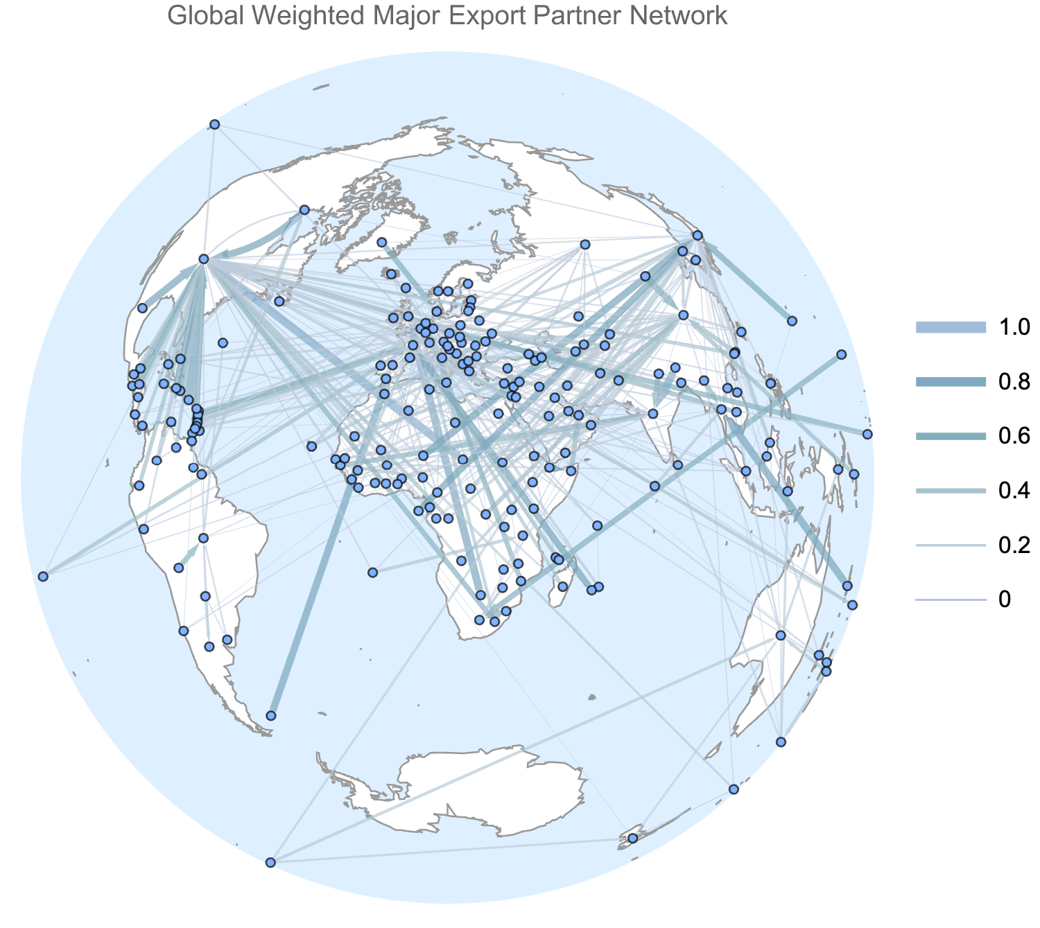
These plots highlight strong regional trade patterns and commerce hubs centred at major economic powers. Thicker lines represent relationships where a higher percentage of a country’s imports or exports flow through that connection.
Comparison of import and export relationship weights
By comparing the weights of common edges in our import and export networks, we can identify key patterns of dependency and influence in international trade.
Produce a scatter plot of import and export edge weights for edges common to both weighted networks:
In[]:= Module[{
     importEdges = EdgeList[globalWeightedImportRelationships],
     importWeights = AnnotationValue[globalWeightedImportRelationships, EdgeWeight],
     exportEdges = EdgeList[globalWeightedExportRelationships],
     exportWeights = AnnotationValue[globalWeightedExportRelationships, EdgeWeight],
     threadEm = Function[{a, b}, Thread[a -> b]], commonEdges},

    commonEdges = Intersection[importEdges, exportEdges];

    Labeled[Labeled[Show[
       Plot[x, {x, 0, 1}, PlotStyle -> Directive[Dashed, LightGray]],
       ListPlot[KeyValueMap[Callout[#2, #1] &, Merge[{
          (*x axis values*) KeySort[FilterRules[threadEm[importEdges, importWeights], commonEdges]],
          (*y axis values*) KeySort[FilterRules[threadEm[exportEdges, exportWeights], commonEdges]]},
          First[List[#]] &]], PlotRange -> Full], ImageSize -> Large], Map[Text, {"Import network edge weight (fraction of total imports to country A coming from country B)", "Export network edge weight (fraction of total exports of country A going to country B)"}], {Bottom, Left}, RotateLabel -> True],
     Text[Style["Scatterplot of Major Import and Export Relationship Weights in Global Commerce", 15]], Top]
   ] // Rasterize[#, ImageSize -> Large, RasterSize -> 1500] &
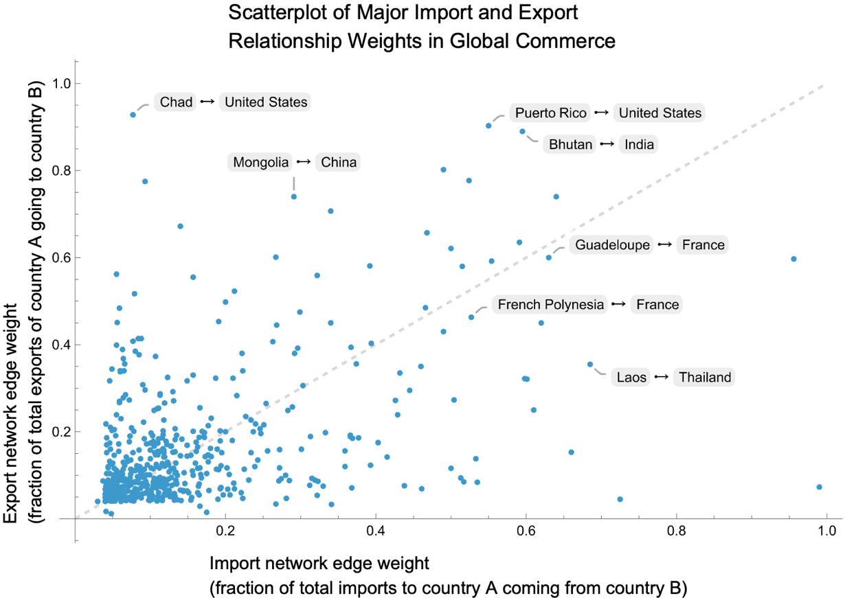
In this scatter plot:
- Points above the diagonal line represent relationships where the export dependency (y-axis) is stronger than the import dependency (x-axis). For example, Puerto Rico depends on the United States as a market for a about 90% of its exports, whereas it imports a little under 60% of its goods from the US.
- Points below the diagonal line represent relationships where the import dependency is stronger than the export dependency. For instance, the Falklands import over 70% of their imported goods from the UK, but the UK is a market for under 10% of the Falklands exports.
- Clustered points near the origin indicate that most trading relationships involve relatively small percentages of total trade (<20%), showing diversification in most countries’ trading patterns.
The scatter plot highlights how smaller economies often have highly concentrated trade relationships with major economic powers, while most countries maintain diversified trading portfolios with their major partners. This pattern of asymmetric dependencies is particularly evident in relationships influenced by geographic proximity, historical colonial ties, and economic size disparities. It’s important to remember that these edges represent only the major commercial relationships as identified by the World Factbook, meaning they capture the most significant trade flows from each country’s perspective rather than all trade relationships globally.
By subtracting the import network weights from the export network weights, and plotting a histogram of the resulting data, we can estimate the distribution of commercial relationships from most import-dependent to most export-dependent:
In[]:= With[{
     importEdges = EdgeList[globalWeightedImportRelationships],
     importWeights = AnnotationValue[globalWeightedImportRelationships, EdgeWeight],
     exportEdges = EdgeList[globalWeightedExportRelationships],
     exportWeights = AnnotationValue[globalWeightedExportRelationships, EdgeWeight]},
    ReverseSort[Map[Subtract @@ Values[#] &, GroupBy[FilterRules[Join[Thread[exportEdges -> exportWeights], Thread[importEdges -> importWeights]], Intersection[importEdges, exportEdges]], First]]] // Labeled[Histogram[#, PlotRange -> Full, PlotLabel -> Style["Distribution of Trade Dependency Asymmetries in Global Commerce", 14]], Text /@ {"Export dependency minus import dependency", "Frequency"}, {Bottom, Left}, RotateLabel -> True] &
   ] // Rasterize[#, ImageSize -> Large, RasterSize -> 1500] &
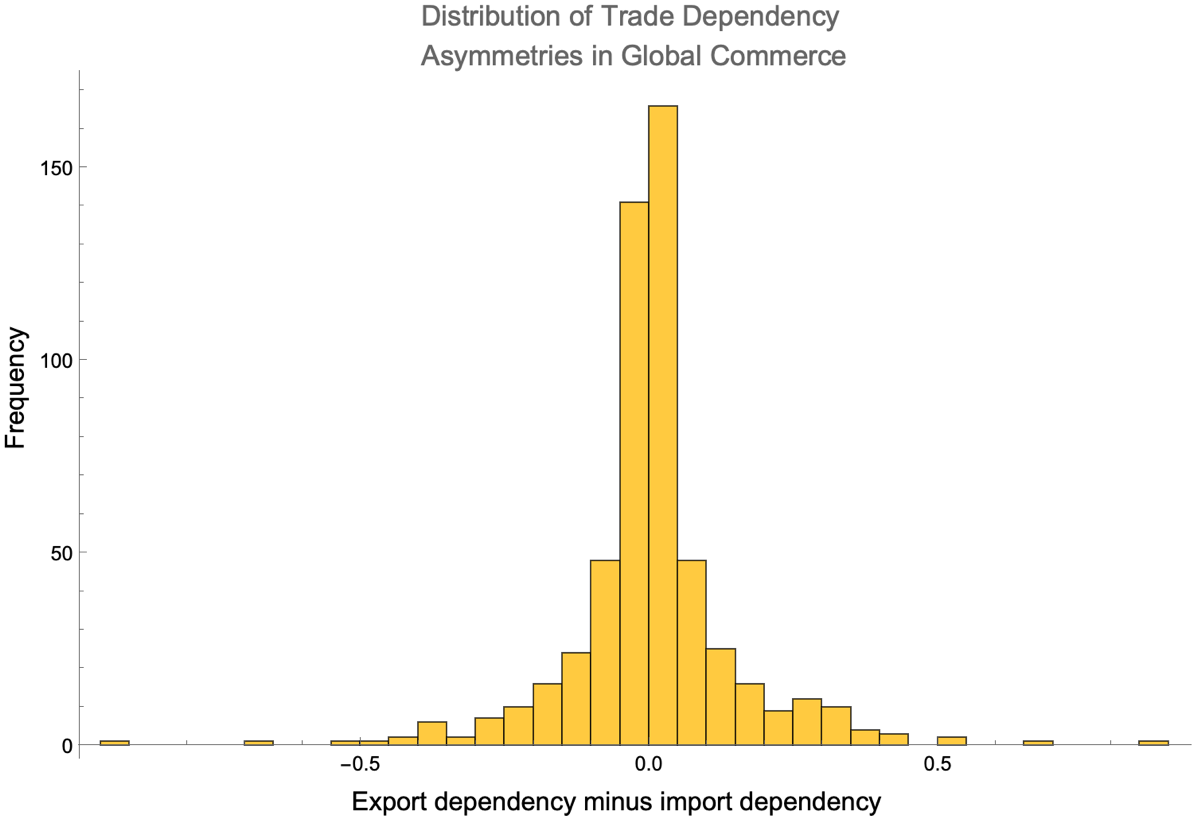
The x-axis measures the difference between import and export dependencies for each trading relationship. A value of zero on this axis represents a balanced trade relationship, in the sense that a country’s reliance on imports from another is equal to its reliance on exports to that same country. Negative values indicate a stronger import dependency, meaning a country imports more goods from another than it exports to them. Positive values suggest a stronger export dependency, where a country exports more to another than it imports.
We can also produce rankings of countries by the magnitude of their dependencies. Here are the top 10 largest trade asymmetries according to our data:
In[]:= With[{
      importEdges = EdgeList[globalWeightedImportRelationships],
      importWeights = AnnotationValue[globalWeightedImportRelationships, EdgeWeight],
      exportEdges = EdgeList[globalWeightedExportRelationships],
      exportWeights = AnnotationValue[globalWeightedExportRelationships, EdgeWeight]},
     Labeled[#1, Text[Style[#2, 14]], Top] & @@@ Thread[{
        ReverseSort[Map[Subtract @@ Values[#] &, GroupBy[FilterRules[Join[Thread[exportEdges -> exportWeights], Thread[importEdges -> importWeights]]
             , Intersection[importEdges, exportEdges]], First]]] // Map[Dataset, {Take[#, 10], Take[#, -10]}] &,
        {"Top 10 Relationships Where Countries Are Most Dependent on Partners as Export Markets", "Top 10 Relationships Where Countries Are Most Dependent on Partners as Import Sources"}
       }]
    ] // Reverse // Row[#, Spacer[10]] &
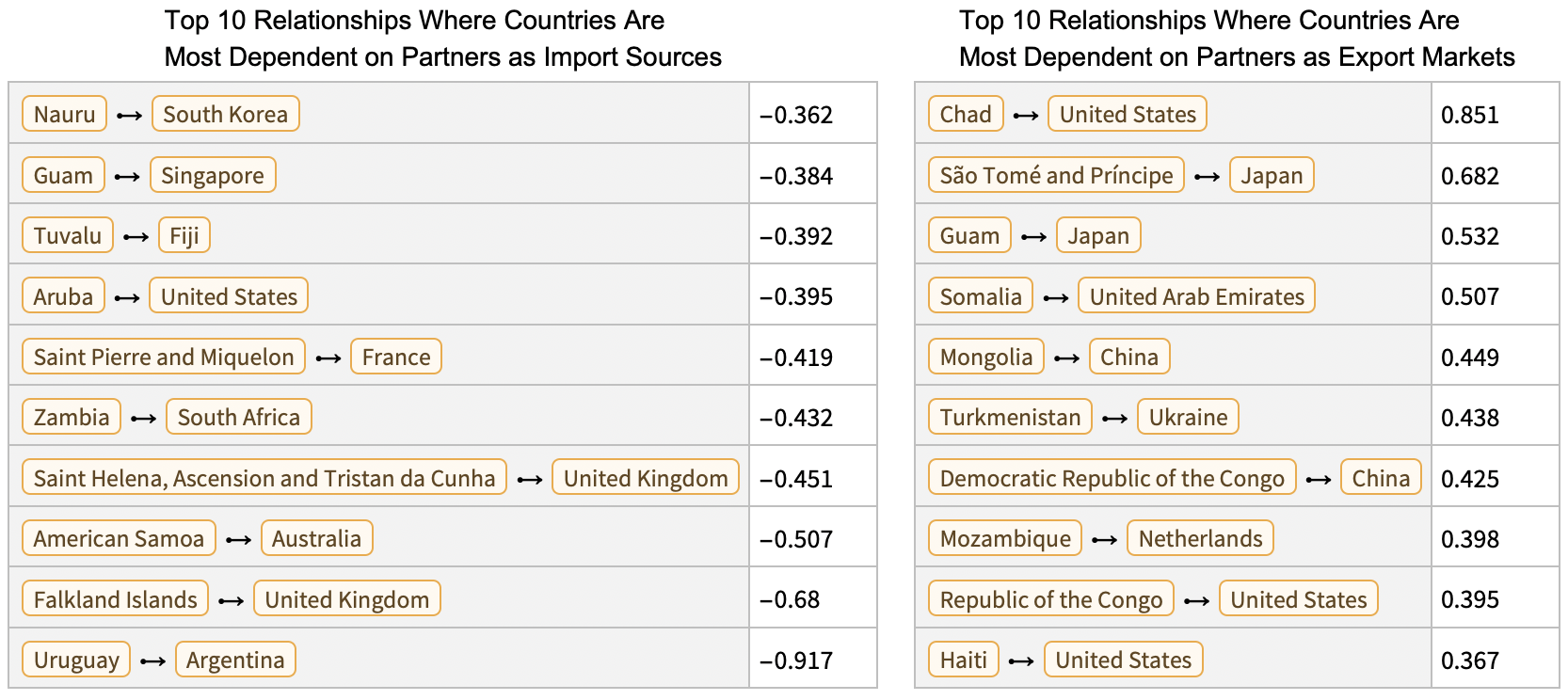
Countries at the top of the import-dependent list (like Uruguay with Argentina) rely heavily on specific partners for their imports while exporting proportionally less to those same partners. Conversely, countries at the top of the export-dependent list (like Chad with the United States) are highly dependent on specific markets for their exports while importing proportionally less from those partners.
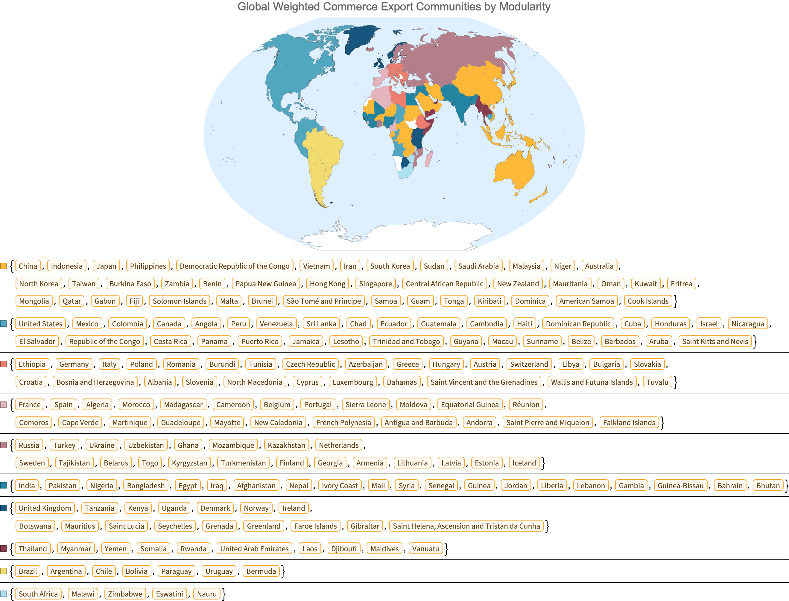
Global export communities by modularity
The network visualizations we’ve examined so far don’t immediately show us how countries naturally cluster into trading groups or blocs. To identify these natural groupings, we can apply community detection algorithms to our weighted export network. Using modularity-based community detection on our weighted export network, we can identify clusters of countries that trade more with each other than with the rest of the world.
Visualise groups of countries whose mutual exports represent larger shares of total national exports than exports from other countries (white represents missing data):
Compare the plot above to this map of free trade areas worldwide form Wikipedia:
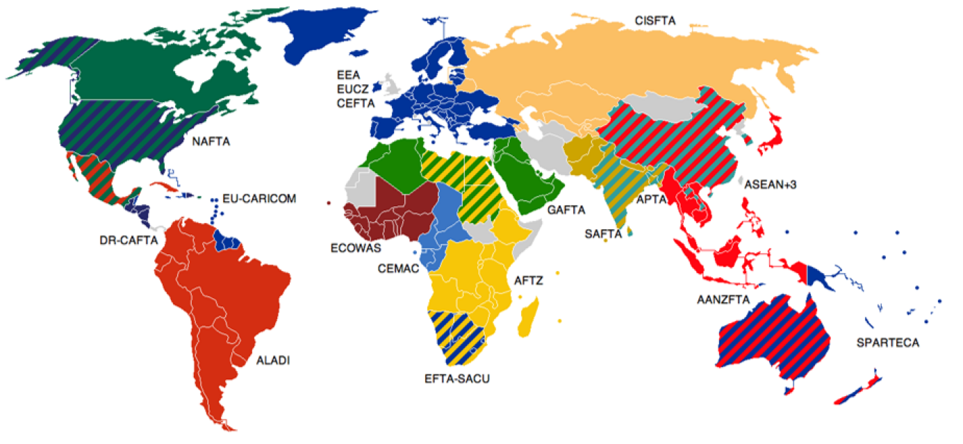
(Wikipedia: Trade bloc, Free trade areas worldwide, by user Emilfaro**)
The modularity-based community detection results show striking regional patterns that largely overlap with established trade blocs and agreements. North America, South America, Europe, Russia and parts of Central Asia, China and parts of Southeast Asia, and Australia/New Zealand each form distinct communities. These natural groupings often mirror formal trade agreements like NAFTA, MERCOSUR, the EU, ASEAN, and others, demonstrating how geographic proximity and policy decisions reinforce natural trading patterns.
Reflection and Concluding Notes
The analysis here reveals how smaller economies often develop asymmetric trade relationships with larger ones, sometimes relying heavily on a single partner for either imports or exports without reciprocity. These dependencies create potential vulnerabilities but also reflect practical economic realities shaped by geography, historical connections, and resource distribution.
Perhaps most interesting is how the detected trade communities largely align with formal trade agreements while occasionally revealing unexpected connections. These natural groupings demonstrate that while policy decisions certainly influence trade patterns, underlying economic complementarity and geographic proximity remain important forces in shaping global commerce.
This network perspective on international trade provides a different lens through which to understand global economic relationships; one that emphasizes connections and interdependencies rather than just individual country statistics. As global trade continues to evolve amid changing geopolitical landscapes, these network representations offer valuable insights into the resilience and vulnerability of international commercial relationships.
Cite this work
Trading places: a network analysis of global commerce by Phileas Dazeley-Gaist Wolfram Community, STAFF PICKS, March 14, 2025 https://community.wolfram.com/groups/-/m/t/3416904